Header Style Variants
This section will describe how to change your site header options. The site header is the section that's above your hero image and it includes the menu bar, the site name, and your logo if you happen to upload one. As you're using your site and adding more things to it, you might find that it's getting a bit too tight for all of the Menu items and information you want to share in the menu bar. You can alter the Header configuration to show everything on one line. There are ways to clean it up manually. You can shorten Menu titles like "Union Member Benefits" to just say "Union Benefits", or change "Contract News" just to read "Contract", but there's also a way to switch this out so that it fits better.
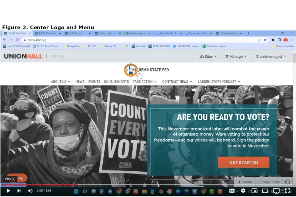
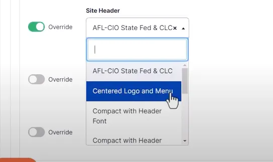
- Navigate to "Manage" and "Appearance" because this is about the appearance of your site and then scroll down to "Components", because the "Site Header" is a component of your site, and then go to "Global" and select "Global", then scroll down to "Site Header" and enable the "Override" toggle and switch it to "Center Logo and Menu" (see Figure 2.).
 |
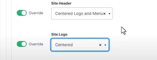
- If you want to Center the logo and the menu in this case you toggle the Logo "Override" and select "Centered" and that'll Center the logo above the menu. if you don't choose this it'll continue to be off to the left.
- You can test out all of these if you want to remember we're going to go to "Components", because this is a component of your site. Select "Global" and scroll down to the "Site Header".
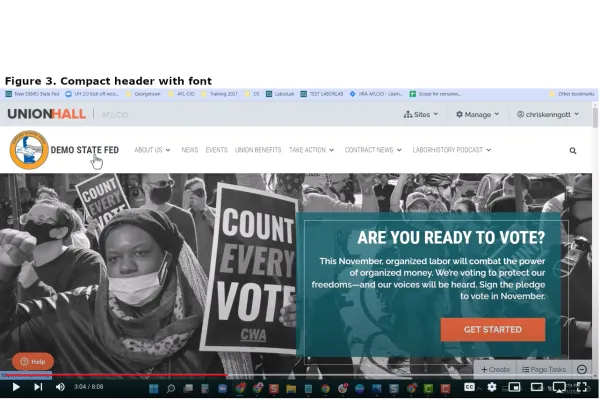
- Find the "Compact header with font" option as is displayed in Figure 3, then go back to the site. In this configuration, everything fits because the font is a little bit more compact.
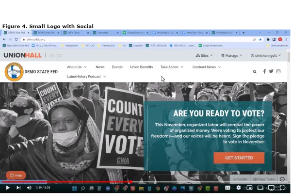
- You can see the "Small Logo with Social" selection for the header (see Figure 4.).
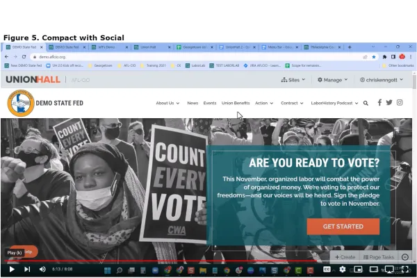
- Figure 5. is "Compact with Social" which is a better setting for this example site with multiple long menu titles.


